What is the best font for labels?
Other articles you might like:
The fonts you choose for your product labels do more than display words—they set the tone for your brand, create a mood, and help connect with your customers. The right typography can make your product stand out, while the wrong choice can send mixed messages.
To help you make the best choice, the Avery design team put together some simple tips for picking the perfect font for your labels. Whether you’re ordering custom labels or printing them yourself, these tips will guide you in the right direction.
The Difference Between a Typeface and a Font
While “typeface” and “font” are often used interchangeably, they have distinct meanings. A typeface is the overall design of a set of characters, while a font refers to a specific variation within that typeface, such as weight, width, or style. For example, Times New Roman is a typeface, and Times New Roman Bold, Italic, or Light are fonts within it.
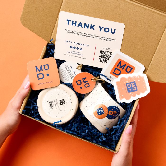
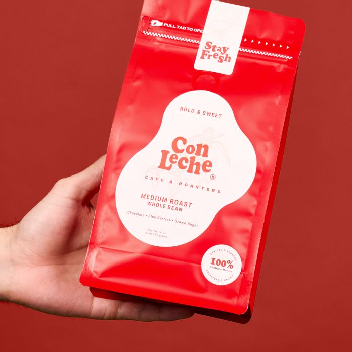
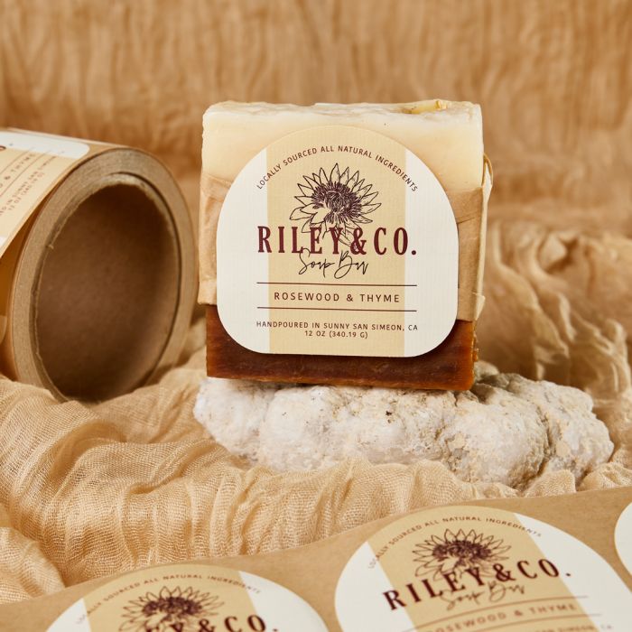
In the four images above, we showcase different styles of serif fonts to highlight the variety and versatility available for your labels. Understanding this difference helps you choose the right fonts for your labels.
The Eight Font Categories
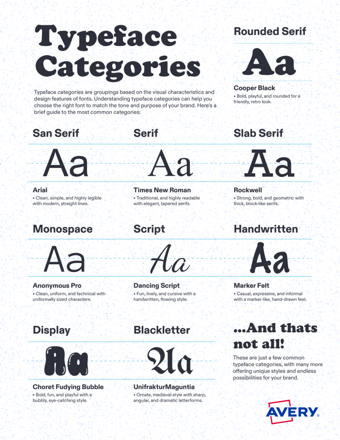
While typography can be broken into many subcategories, these eight main types provide a practical guide for choosing label fonts. Each has a distinct style and personality. Understanding these categories can help you make more intentional design choices and ensure your labels convey the right message.
Whether you want a sleek, modern look or something with a handcrafted, vintage feel, these categories offer a starting point for creating a cohesive brand identity.
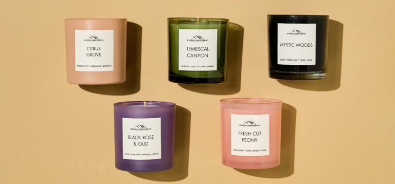
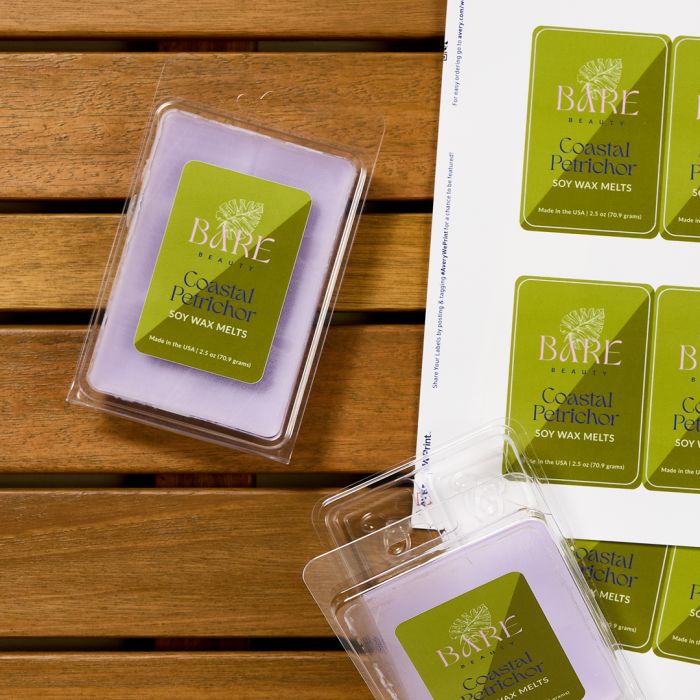
Serif – Classic and traditional, serif fonts have small strokes (serifs) at the ends of letters, conveying trust and sophistication. They are often used for upscale or timeless brands and are popular in industries like publishing, luxury goods, and financial services.
Sans Serif – Clean and modern, sans serif fonts lack serifs, making them great for a sleek and minimalistic look. They’re commonly used for tech, beauty, and contemporary brands, offering a fresh and approachable feel that enhances readability, both in print and digital formats.
Slab Serif – Bold and sturdy, slab serif fonts have thick serifs that create a strong, confident impression. They work well for brands that want to feel dependable and durable, such as outdoor gear, industrial products, or bold packaging designs, adding a sense of strength and resilience.
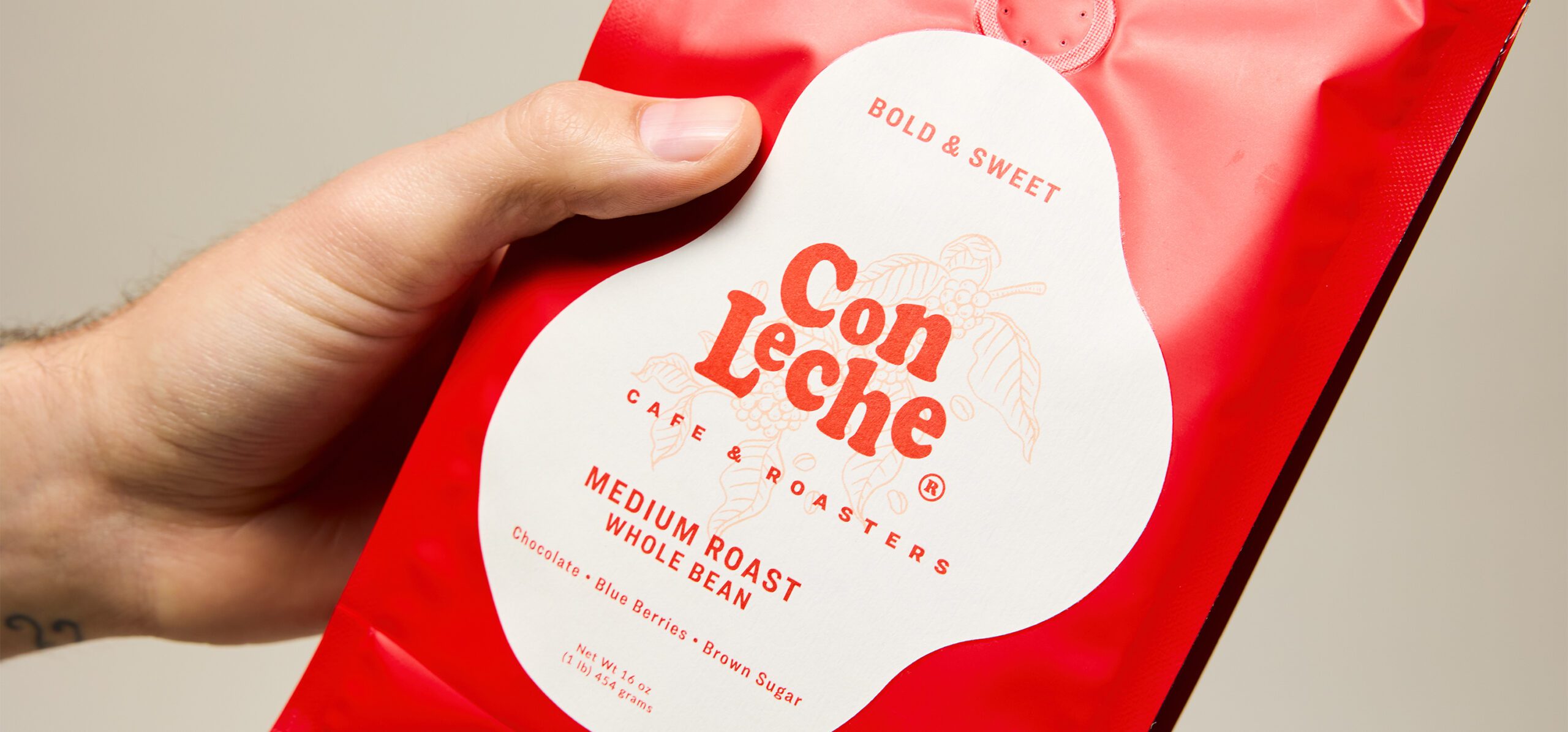
Script – Flowing and elegant, script fonts mimic handwriting and can range from formal to casual styles. They add a sense of luxury or creativity when used carefully, making them popular for wedding invitations, boutique packaging, and premium branding, but should be used sparingly for legibility.
Handwritten – More relaxed and natural than script fonts, handwritten fonts add a personal, artisanal touch. They’re ideal for brands that want to feel friendly, organic, or handmade, commonly found in food packaging, stationery, and DIY products, conveying authenticity and warmth.
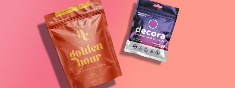
Monospace – Evenly spaced letters give monospace fonts a technical or typewriter-style feel. These fonts are often associated with coding, retro aesthetics, or utilitarian designs, making them a great choice for modern tech brands and nostalgic branding, as well as easy-to-read labels in structured layouts.
Display – Bold, decorative, and eye-catching, display fonts are designed for attention-grabbing headlines but not for small text. These fonts add personality and uniqueness to packaging, making them great for logos, event branding, and statement pieces, ensuring a brand stands out on shelves or online.
Blackletter – Ornate and dramatic, blackletter fonts resemble old Gothic-style calligraphy, often used for vintage or traditional branding. They can add a historic or artisanal touch to your labels, commonly seen in brewery logos, formal invitations, and heritage brands, evoking craftsmanship and tradition.
Mixing fonts from different categories can create a dynamic and balanced look, but be careful not to overdo it—too many competing styles can make your label look cluttered.
Match Your Font to Your Brand’s Personality
Your font should reflect your brand’s identity. Is your brand playful, sophisticated, or artisanal? Choose fonts that align with your brand’s tone and appeal to your target audience. Here are some quick tips:
- Know your audience – Pick fonts that resonate with your ideal customer.
- Pair wisely – Mix a decorative script or display font with a simple sans serif or serif font to keep things balanced.
- Prioritize legibility – Make sure your font is easy to read and meets any regulatory requirements for your product.
- Test different options – Try different fonts with your label design to see what works best.
Make sure the label fonts you select create the right impression for your brand. Once you get a feel for what your brand is all about, it’ll be easier to find the right font or combination of fonts. It may not pop out at you right away, so go through some options. Select a handful of fonts that might work, then narrow them down until you find what works for your products.
Choosing the Right Font Size
Font size is just as important as font style. If your text is too small, it might be hard to read; too big, and it could overwhelm your design. Our designers put together three sample font PDFs to help you see how popular label fonts look in different sizes, colors, and backgrounds.
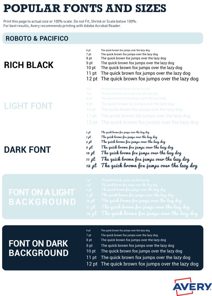
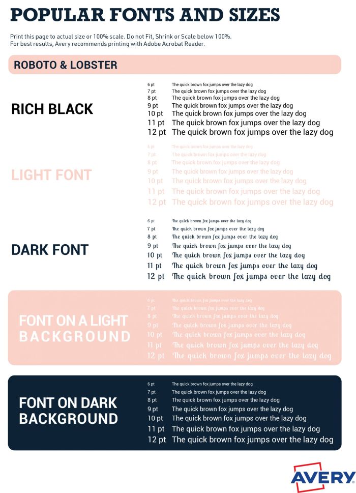
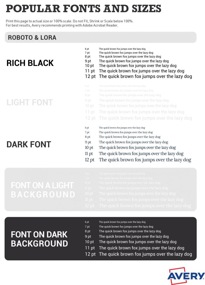
When designing digital labels or e-commerce listings, keep in mind that fonts that look great in print may not be as clear on screens. Test how your font renders in different sizes and resolutions to ensure legibility across all formats.
Consider Accessibility & Readability
It’s important to choose fonts that are easy to read for everyone, including those with visual impairments. Here are some key accessibility guidelines:
- Choose sans serif fonts for small text, as they tend to be clearer at lower sizes.
- Use high-contrast colors between text and background.
- Avoid overly thin or condensed fonts that reduce legibility.
- Ensure proper spacing between letters and lines for better readability.
Test Before You Commit
Before finalizing your label design, do a test run. Avery offers free label templates and design tools so you can experiment with different fonts and layouts.
- Pick your label size and personalize a template.
- Play around with fonts and colors to see what works best.
- Print a test version on blank labels or regular paper to check how it looks in real life.
If you’re ordering professionally printed labels, consider printing a small batch first and getting feedback from friends, family, or customers before committing to a large order.
Make Your Labels Stand Out
The right font can make all the difference in how your product is perceived. By choosing fonts that align with your brand and ensuring they’re legible and well-paired, you’ll create labels that not only look great but also help your product connect with customers. So go ahead—experiment, test, and find the perfect font combination to make your labels shine!
Hi Bob,
We’re sorry, but our Import Data feature was developed with addresses in mind, so it automatically squeezes everything into one field to fit on a line. Currently, you can’t separate the data that’s in one field. The only way to get the control you want on your call number labels is to put the two words into two different columns in your spreadsheet. If you need more help, please call us at (800) 462-8379. We hope this helps.
We are trying to create call number labels for books. The numbers are two words that need to be on two lines. After importing an esv file into the Avery app when to try to take the number (ex: 400 TST) and add a carriage return between the words the app will not let us. If we take the text box and narrow it horizontally to force the second word to move down the type reduces too small. Essentially we want to create these at 18 pt. Ariel on a 1 x 3/4 label (5428). Is that possible? If so, how do we do it? Thanks.
Hi Frank,
That is a great suggestion. I’ve passed your comment on to our developers as we’re always looking for ways to upgrade our site. Fingers crossed. Thanks again for reading and using Avery products.
Can you add a feature option of edit per row instead of one at a time or the whole page? Avery is the easiest way I’ve found to do labels. I appreciate everything you all do and hope to make it better for us by editing easier. Thanks
Hi Sarah,
There aren’t many fonts similar to Copperplate Gothic available. You might try Lora, Noto Serif, Playfair Display, PT Serif and use bold and all caps. You can also follow these steps to use your own fonts in Avery Design & Print. Or another option is to create your label design in another design software and then upload your final image to Avery for printing or order your custom printed labels. I hope this helps. Please call our Care Center at 800-942-8379 if you need any more help.
Can you recommend a font in your library that is similar to Copperplate Gothic
Unfortunately at the moment, it takes a few extra steps if you want to upload a special font. You’ll have to upload your artwork into the appropriate size Avery template and apply it to the label. If you need guidance, our call center at (800) 942-8379 can help you.
Hi, is it possible to add other fonts to Avrey ? We have the font “Fredericka the Great-Regular” on our web page and would like our labels to have the same. brgds Tronde
Oh good, I’m sure they’ll be able to help. Please let us know if you need anything else. And thank you for reading!
Thanks. I’m using WePrint so I can’t print out a test one to see.
I’ll contact the UK people
Hi Dorothie,
I notice you are writing from the UK. We’ll need a little more information to help you, for instance, are you printing yourself or having Avery print your labels for you? I recommend you reach out to our UK division so they can get more information from you and help you with your labels. You can call them at 0800 80 50 20 or email them at hello@avery.co.uk. Hope this helps.
I need a minimum 4mm font on my labels which according to converter tables is 11.3 (12). However when my labels were printed the wording was only 3mm high. Is this because I shrunk the textbox to fit it on the label? The template is still saying pt 12 font. how can I fix this, other than guesswork?
Yes, unfortunately at the moment it takes a few extra steps if you want to upload a special font. We do have a very large collection of fonts to choose from but if we don’t have the exact one you want it is very simple to upload your own artwork and apply it to the label. If you need guidance, our call center at (800) 942-8379 can help walk you through it.
that’s convenient
Hi Joe, Unfortunately, once you switch from ‘Edit All’ to ‘Edit One’, the functionality to edit all is disabled. You will have to click into each one, one at a time on the sheet navigator and edit them one by one. Or another option is you can start over with a new project, set your font, and then go into edit one to change the text. I hope this helps. If you need more help, please call our Customer Care Center at (800) 942-8379.
How can I make the font size the same on all labels with 11136 and with 5893. I cannot get Edit All to do what I want with the latter.
Hi Stephanie,
Unfortunately at this time, there is not a way to upload your own fonts into our design tool. We recommend creating your artwork in another software program that has the font you need, save it as an image and upload it onto our templates for custom printing or to print yourself. Hope this helps. If you have any other questions, please feel free to reach out to our customer care team at (800) 942-8379 and they can help you.
I was writing to see if there is a way to go about adding (or downloading) additional font options for my projects.
As nice as the loaded fonts are, they aren’t exactly what I need.
Hi Kristi,
When you’re in the Avery Design & Print canvas, click on the text box in your label. A menu will open on the left of your screen. The fonts are listed in alphabetical order when you click on the arrow next to the first font. If you still can’t find it, please call our customer care center at (800) 942-8379 and they’ll be happy to help you.
I cannot figure out how to see all of the font options available for the label I am working on. I am only able to see about five options and there is no scroll bar in the font drop down to see more font options.
I’m not sure where you are writing us from and which of our divisions would ship to your location but here are some links to our custom printing service in various countries. Let us know if we can be of further assistance.
U.S. (ships to U.S. Canada, Puerto Rico and the U.S. Virgin Islands)
Canada (Ships only within Canada)
UK (ships to all EU countries and Switzerland)
France (ships worldwide)
Je voudrais que vous me fassier in etiquette pour mon miel. Honey Nigelle
Hi Junette,
I’m really sorry to hear you are having problems changing the font on your canning labels. We haven’t changed anything recently so I’m unsure of where you are having difficulties.
To change your font, you need to click on the Text Box in the design canvas. Click on the Text tool on the left-side menu and you should see a drop-down menu of available fonts and sizes. If you are still having problems, please call our Customer Care Center here in Brea, CA. They’ll be happy to walk you through any issues. The number is (800)942-8379.
As far as the price of labels, did you know you can now buy blank labels directly from Avery? Buy just one sheet or thousands. The more you buy, the better the pricing. And also, you don’t have to worry about counterfeits or old products with bad adhesives when you buy from some online sellers. You can just order your label sheets online and have them shipped to you.
We also offer professional printing services through Avery WePrint, so you can have your 2″ round canning labels custom printed if you like.
Again, please reach out to us if you need further help.
Melanie
For the life of me, I CANNOT find how to change the font and size on my canning labels. It used to be so easy and you’ve changed things. I always by the 2″ glossy white round labels, I have bought thousands! from Staples. I also have to complain about the huge price you’re wanting now. $17 something for 120. I now have to get them on ebay. What’s up with that? Can you switch me back to the last way of doing the online self print please? Or tell me where I can find the font change and size change. Thank you