How To Design a Website for a Great User Experience
Estimated reading time: 10 minutes
Do you need to design a new website and don’t know where to start? It can certainly be a daunting process getting started and knowing what to tackle first. Whether it be a website for your small business or a task-based app, this overview was written by our Avery Creative Manager and Designer, who will take you through steps to help you understand how to design a website for a great user experience.
Define Your Vision
Before you start exploring colors and images for your website or app, it’s important to understand what you are trying to create. In a couple of sentences describe the vision of your website or app, then ask yourself the following questions:
- Who is my target audience or end-user?
- What problem am I trying to solve for them?
- What am I hoping to achieve?
- How will I know if my website or app will be a success?
Once you have answered these questions, you’ll have a better understanding of your vision and the experience you’re trying to create. A great website design is user-centric and encompasses empathy. When you understand your users’ needs and frustrations you can use that to create an ideal experience.
Before You Begin
Whether you are designing the website yourself or hiring someone, understanding the user experience development process is key to bringing your vision together. Think of this as the brainstorming phase of your website or app which will be the foundation.
The user experience (UX) is how a user interacts with and experiences a product, system, or service. This includes a person’s perceptions of ease of use and efficiency. Overall, its objective is to design a system that offers a great experience to its users.
In UX design you typically go through a discovery phase, design phase, and validation phase.

Discovery Phase Methodology
- Identify goals and objectives
- Identify the target audience
- Conduct research
- Document personal experiences (i.e. user interviews)
- Create a persona
Design Phase Methodology
- Outline key features
- Create a sitemap and user flow
- Create a wireframe
- Identify visual design elements such as color palette and fonts
- Develop content
- Build look & feel
Validate Phase Methodology
- Conduct user testing
- Provide surveys and questionnaires
- Gather feedback
- Implement feedback
When going through the process you might encounter some challenges. When working under deadlines think about the best way to work within a specific time frame. Will you have enough resources to produce this website or app? You might consider conducting enough research to avoid any pitfalls or rework. If you are taking a phased approach, think of gathering enough people to test with to gain the feedback needed for the next iteration. Once you have gone through the understanding of how the design process works overall, you are ready to take the next step.
Discovery Phase
Knowing who your target audience is is the first step to creating a successful experience. Who are the people you will be marketing to? Why would they use your website or app?
As part of the discovery phase, you’ll want to start by creating user groups. For example, you might want to have a primary user group and a secondary user group. Let’s say you are creating an app to sell candles. Then your primary user group might be candle enthusiasts who frequently use candles. Your secondary group might be people who are new to candles.
You can use the following template to define some attributes for each user group:
- User group profile: The name of the user group
- Primary goals: The main goal of the user group, i.e., to sell candles
- User Roles: The group’s personality, i.e., are they busy business owners or hobbyists?
- User Demographics: Age, gender, family status, region
- Experience: The users’ education and how well they use technology, i.e, are they knowledgeable in the subject matter or beginners?
- Organizational attributes: The size of company, the department the user works for or the job type
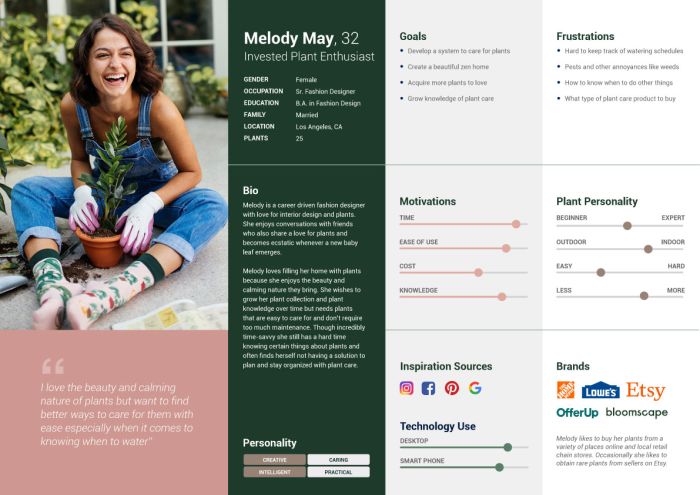
Once you create your user groups, you’ll want to conduct more research and gather personal experiences from real people. You can do this by conducting user interviews with which you can create your personas. Personas are fictitious people that represent real users to help identify the motivations, frustrations, and goals that drive their online behavior.
Designers create personas to understand and build empathy for the user to create a better user experience for them. Below is an example of a persona created for a task-based app for plant lovers.
Design Phase
Your research and interviews should provide you with rich information you can use to identify key features for your website or app. It might be better to not try to implement a ton of features right off the bat. From what you gathered during the discovery phase from your research and user interviews, write out the following:
- What are the similarities?
- What are differences?
- What features are my users are looking for?
Knowing the answers to these questions, then you can outline the top features your website must have so you can get it up and running faster.
Sitemap and User Flow
It’s important to understand how your user will interact with your website. At this point, you can start laying out your sitemap and user flow.
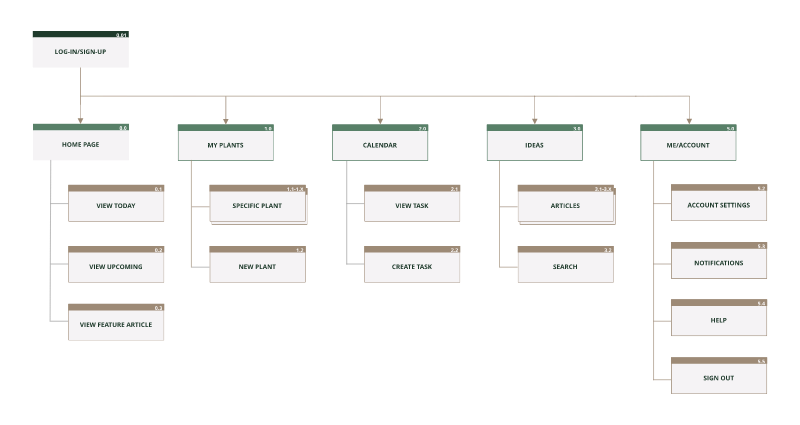
A sitemap is a list of pages on a website or app. Think of it as a map telling you how to get from point A to point B. There are many different sitemap examples depending on the type of site or app you’re creating. Defining what’s in your sitemap will help you understand what’s really needed for it to launch.
You can layout your sitemap in many ways such as sketching on paper, using a design program or online app or even putting something together in PowerPoint.
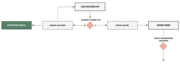
The user flow is the path taken by users on a website or app to complete a task. Doing this task will put you in your users’ shoes to see how they might navigate during their experience on your site. It will also help ensure there are no dead-end paths or errors which might lead to users leaving your site completely.
Wireframes
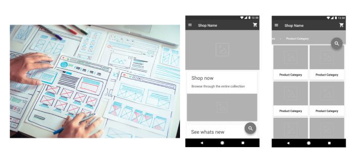
A wireframe is a drawing of your website or app’s pages. It’s best to not add color at this point so you can focus on the functionality rather than the aesthetics. In essence, wireframes consist of simple lines and shapes that represent the “skeleton” of your website or app.
You can draw wireframes by hand or put them together on the computer. Good wireframes use design patterns that communicate the structure to the user in a short amount of time.
Visual Design
In this phase, you are ready to bring all your research, mapping, and wireframes to life visually to produce a good user interface. If you are not designing your website or app yourself, think about hiring a web or visual designer and possibly a developer.
The user interface (UI) is the way a person interacts with a device like a computer, tablet, smartphone, or other similar items. This can include display screens, keyboards, a mouse, menus, and icons. It is also the way through which a user interacts with a website or app.
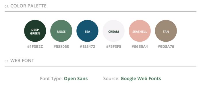
First, you’ll want to identify a color palette to use for your website. Pick colors that set the mood for what you are creating and that also relate to the audiences you are talking to. Also, make sure you are picking web-safe colors that are in RGB.
Next, you need to pick fonts for your website or app. Keep in mind when choosing fonts that you pick a web font. If you pick a unique font, most users will not have that on their computers. When a user doesn’t have a font on their computer it will default to the web-safe font. You can explore web fonts on sites like Google Fonts.
Content Development
Think of what images resonate with your audience the most and design a logo that best represents your brand. If you are selling products check out Product Photography Tips to help produce the ideal photos for your website.
Your website or app will also need copy. Consider hiring a freelance copywriter that specializes in SEO so your website will gain more traffic and have better visibility when people are searching for your product on the web.
Buildout
Now that you have your color palettes, fonts, and content, you can start putting together the overall look and feel. Designing a website look and feel will serve two purposes. First, it will brand your product as unique, helping you stand out from the competition. Second, it increases ease of use through visually pleasing images, color use, and consistency of design.
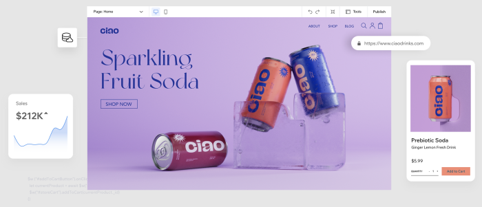
If you are building a website yourself, there are many great website builders like Wix to help you. If you are building an online store, check out Selling Online & Building an Ecommerce Store for more tips and tricks to help build up your site.
Validation Phase
Once you feel your site is ready to go, it’s time to make sure it really is through user testing, surveys, questionnaires, and feedback to help you find errors or things that could be improved.
User Testing
Going through user testing helps validate your entire user experience. During this phase, you want to ensure your website or app is usable in the real world. You might want to keep in mind these 10 usability principles as you are going through this phase:
- Make the system status visible
- Match the user’s world
- Give the user control and freedom
- Be consistent and adhere to standards
- Prevent errors before they start
- Use recognition over recall
- Allow for flexibility and efficiency
- Use aesthetics and minimalist design
- Help users recognize, diagnose and recover from errors
- Provide help and documentation
You can read more on Jakob Nielsen’s 10 general principles for interaction design. They are called “heuristics” because they are broad rules of thumb and not specific usability guidelines. Also, ensure your website or app meets accessibility standards for people with disabilities.
When conducting user testing, get users who would actually buy your product. Check out all there is to know about usability testing here.
If you are conducting the user testing yourself, download this template from GitLab to guide you through the interview process. Doing user testing with even one or two people is always better than none.
Surveys & Questionnaires
Another great way to validate your user experience is by using surveys and questionnaires. Think of adding this at the end of your user test interviews. Surveys and questionnaires are useful if you are looking for a more quantitative form of feedback. You can provide a score of how usable your website or app is by using the System Usability Scale (SUS).
Gather Feedback & Implement
Your end-user is your number one priority. Make sure you gather all the feedback from your users and make the necessary changes to your website or app experience. Doing this can help lead to a more successful launch and avoid bigger problems down the road.
Ready, Set, Launch!
Once you’ve gone through all the phases of the UX process you are ready to launch. Note that there are many variations in the process depending on circumstances such as timing, budget, and resources. However, going through the UX process will better help ensure you are setting yourself up to provide the best user experience to your audience.
When you are thinking of adding more to your website or app, or just refining, going through the cycle of defining, designing, developing, and deploying is a good rule of thumb. Keeping in mind a user-centric model will help your website or app gain the attraction and success you desire and will lead to users coming back time and time again.


