6 Product Packaging Trends
Check out the latest ideas in custom packaging
Deciding on the packaging and labeling for your new product is a big step. Your brand identity – the color, design, and logo – is what identifies and distinguishes your products from others. So, whether you’re just starting a business or you’re looking to update or refresh your packaging design, we’ve put together a list of 6 packaging trends that are catching consumers’ eyes.
Look for sustainability, pops of color, cool graphics, sleek blacks, and shiny metallics to lead the way in custom packaging designs. From bottles and cans to boxes and bags, we put together some bright, fun, luxurious, and interesting ideas for you to think about when planning your packaging.
1. Sustainability
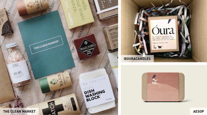
Consumers are becoming more eco-conscience and have shown they are willing to pay a little more to shop more responsibly. This movement plays a large part in packaging trends. Key things customers are looking for are reusable materials or low eco-impact packaging. Sustainable product packaging is simplistic, rustic, and organic. It allows brands to add a touch of character and charisma to their packaging and labels.
2. Bold colors
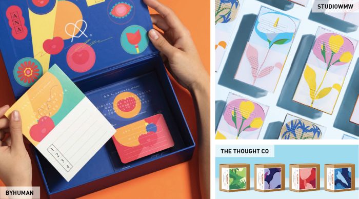
Continuing a tried-and-true trend, using bright vibrant colors can create eye-catching packaging. This can be done with fun patterns, vibrant color blocking, or classic graphics and illustrations. Bold colors can include color variety, bright color, or a lot of a single color. In the past, when other assets in a design would be toned down, now you can go all out, be loud and proud. Check out 3 Smart Ways to Use Color on your packaging for more help.
3. A touch of nostalgia
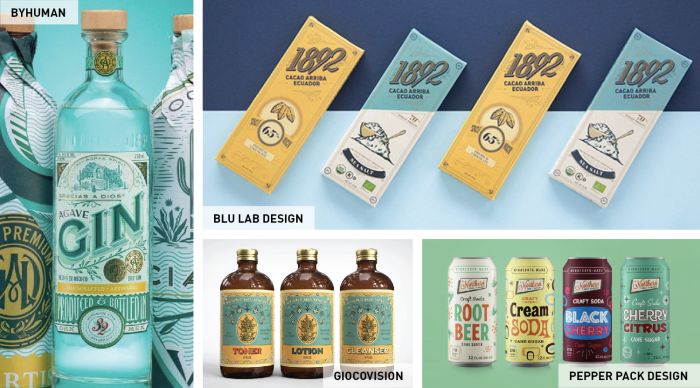
Vintage-inspired packaging has been popular for a while but it promises to continue. Focus on the authenticity of the vintage touch, not just on your product labels but the containers such as bottles, boxes, and compacts should also contribute to the overall theme. We’ve seen the mid-century modern design for years now, so try and push back even farther in time for a really unique look.
4. Let’s get graphic
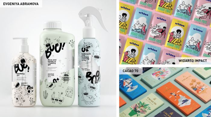
Designs that incorporate illustrations or graphics are becoming very popular. Using whimsical designs that tell a story on your packaging can guarantee memorability and evoke emotional responses. Make sure to incorporate the theme in all parts of your branding and packaging. It will not only give your product personality and character but it will also make it very distinguishable from your competitors.
5. Keep it mint in metals
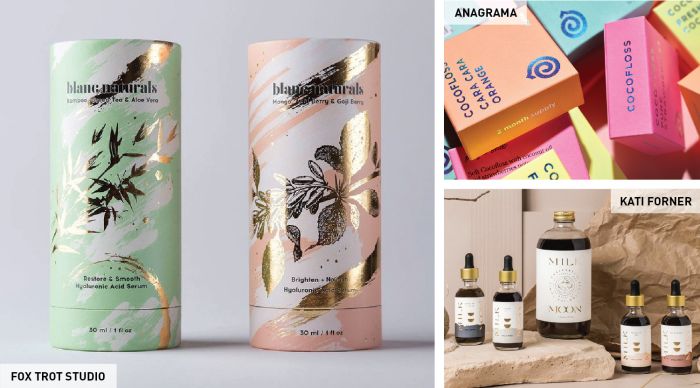
Using metallics easily pushes designs into a luxury aesthetic. Whether you choose foil packaging and metallic labels or small accents of spot varnish, they all can provide impact. Spot varnish allows you to add small metallic elements to labels and packaging to highlight specific parts of your products, and it’s more affordable than full foil or metallic packaging.
6. New noir
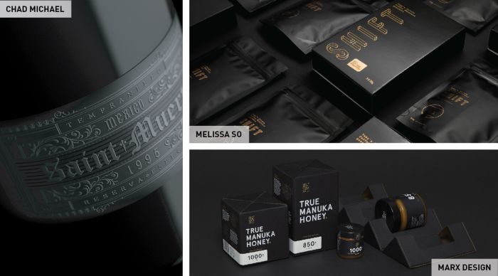
You can never go wrong with classic black. With different printing methods becoming readily available and affordable, there are new ways to play with black. You can create textures using techniques like embossing, spot varnish, and white ink instead of traditional print to form your message. It’s also versatile, complementing any style from minimalist and modern to vintage and maximalist.